

NTS premises reconstruction study
New design concept for existing spaces
When designing the study for NTS, we addressed the reconstruction of older spaces with the aim of applying a new, contemporary design concept to them. The task was to visually unify the existing spaces, soften their appearance and at the same time create an environment that is functional, easy to navigate and pleasant for both visitors and staff.
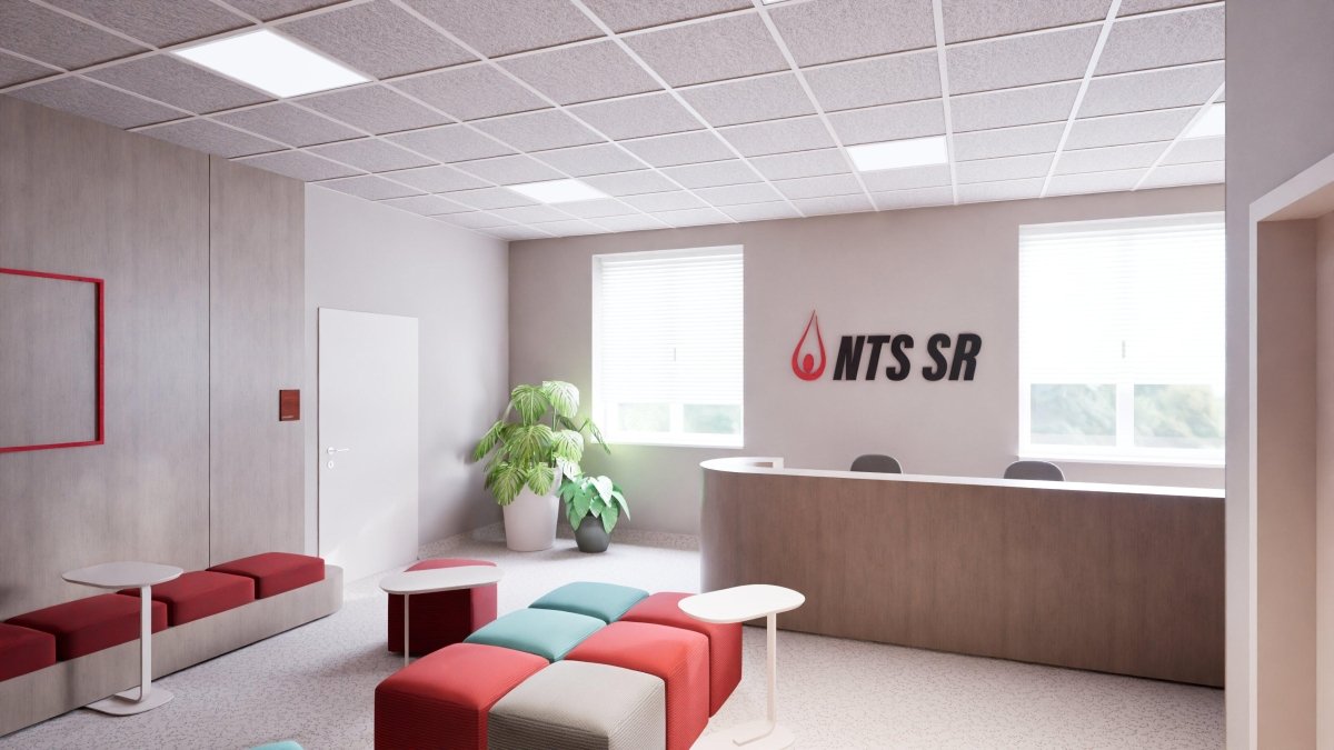
An important part of the concept was retaining the colour red, which naturally represents the identity of the facility – blood and blood collection. Red has become one of the main visual accents of the design and serves not only an aesthetic but also a wayfinding function in the space.

Colour and material unification of the space
The main theme of the design is the colour unification of the spaces into a warm neutral beige, which is easily applicable to various new and original surfaces and materials. This colour scheme is reflected in the walls, floors, doors, ceilings and soffits, creating a calm, clean and timeless foundation for the entire interior.
A natural complement to the beige concept is the natural wood decor, which appears on furniture elements, wall panels and seating furniture. Wood brings warmth and a human dimension to the space, which is extremely important in a healthcare environment.

Red and blue as an identifying element
The complementary colours of the design are red and blue, which appear in the interior through furniture details, upholstered elements and highlighted accents. Red refers to the main identity of NTS and at the same time gives the space energy and a clear character. Blue and light blue, on the other hand, help with orientation and visually lighten the space.
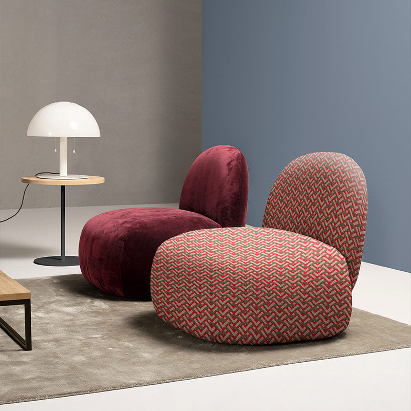
In the design, we work with a combination of sharp lines, which are typical for this building type, and rounded elements on the furniture, creating a pleasant contrast between the technical and the soft, friendly expression of the interior.

Working with the original spaces
The concept is not based on completely removing the original character of the spaces, but on refining and supplementing it. In the design, we therefore combine original surfaces with new interventions that unify the interior and bring it into a contemporary form.
In exposed and important places, we use wooden panels, which have not only an aesthetic but also a wayfinding significance. They create natural focal points in the space and give individual parts of the interior a clearer identity.

Wayfinding as part of the concept
Great emphasis was also placed on the wayfinding system, which directly follows the overall interior design. It follows the colour and material concept of the space – it works with wooden and red elements, simple graphics, clean labelling and prominent arrows.
The goal was to create a system that is clear, intuitive and immediately readable for users, while also acting as a natural part of the architecture.

A more pleasant setting for visitors and staff
The design also included creating an environment that does not feel sterile and impersonal, but rather calm, human and refined. We therefore included not only a pleasant colour scheme and wood in the concept, but also softer upholstered elements, small furniture and greenery where the space allowed.
The resulting concept works with the atmosphere of the space so that the entire interior is perceived as modern, functional and at the same time considerate towards the people who use it.

Result of the study
The study for NTS presents a design that respects the original spaces while transforming them into a new, visually clean and functionally well-thought-out whole. By retaining red as a reference to the main identity of the facility, supplemented by neutral beige, wood and subtle blue accents, the result is an interior that feels welcoming, easy to navigate and contemporary.
The overall design creates a pleasant environment for visitors and staff and shows that even the reconstruction of older spaces can bring a strong, unified concept with a clear identity.

